Invention Corps
—
Designing an informative and
intuitive website that emphasizes
Invention Corps’ creative identity.
—
Discipline Brand Development, Web Design
Timeline May 2020 - September 2020
Tools Figma, Illustrator, Photoshop
Overview
I led a team of 9 developers and designers through the ideation, iteration, and development of our organization website. Initially created as a platform to host our virtual project showcase, the website has since become a hub for all things Invention Corps—from our past projects, to member profiles, to recruitment information, to our BLM fundraiser initiative. The site has effectively communicated our mission and values for the purposes of client acquisition and fall recruitment.
Background
Invention Corps is a multidisciplinary organization that practices human-centered design through partnerships with professors, companies, non-profits, and any entity for social good on campus and beyond.
Having been a part of the organization for three semesters and counting, I had the privilege to witness all the amazing work of my teammates and watch as our club evolved to generate even greater impact. Thus, given the opportunity as Chief Marketing Officer, I wanted to give back to the club and show the world who we are.
Problem Statement
As the pandemic hit in late March, we knew we had to prepare for a virtual semester, meaning we needed an effective platform for client acquisition and fall recruitment. However, as it stood, our club identity was sprawled across a few semi-active social media channels. We needed a platform that was uniquely ours.
Who is our user?
Potential clients and applicants.
Our users need…
a website design and visuals that clearly depict our club culture, diversity, and values
a comprehensive overview of our past projects, including our ideation and design process, individual contributions, and final deliverables
a way to get to know our members, through personal quotes, links to social and professional profiles, and club demographic breakdowns
a hub for all-things-recruitment, including an application timeline, our mission statements, and club history
The Solution
After months of ideation, iteration, diverging and converging, we created an all-inclusive platform to showcase Invention Corps’ unique identity to anyone who so wishes to see it. With the creation of our website, we transformed our organization from ‘just another club’ into a diverse, impactful, and welcoming organization.

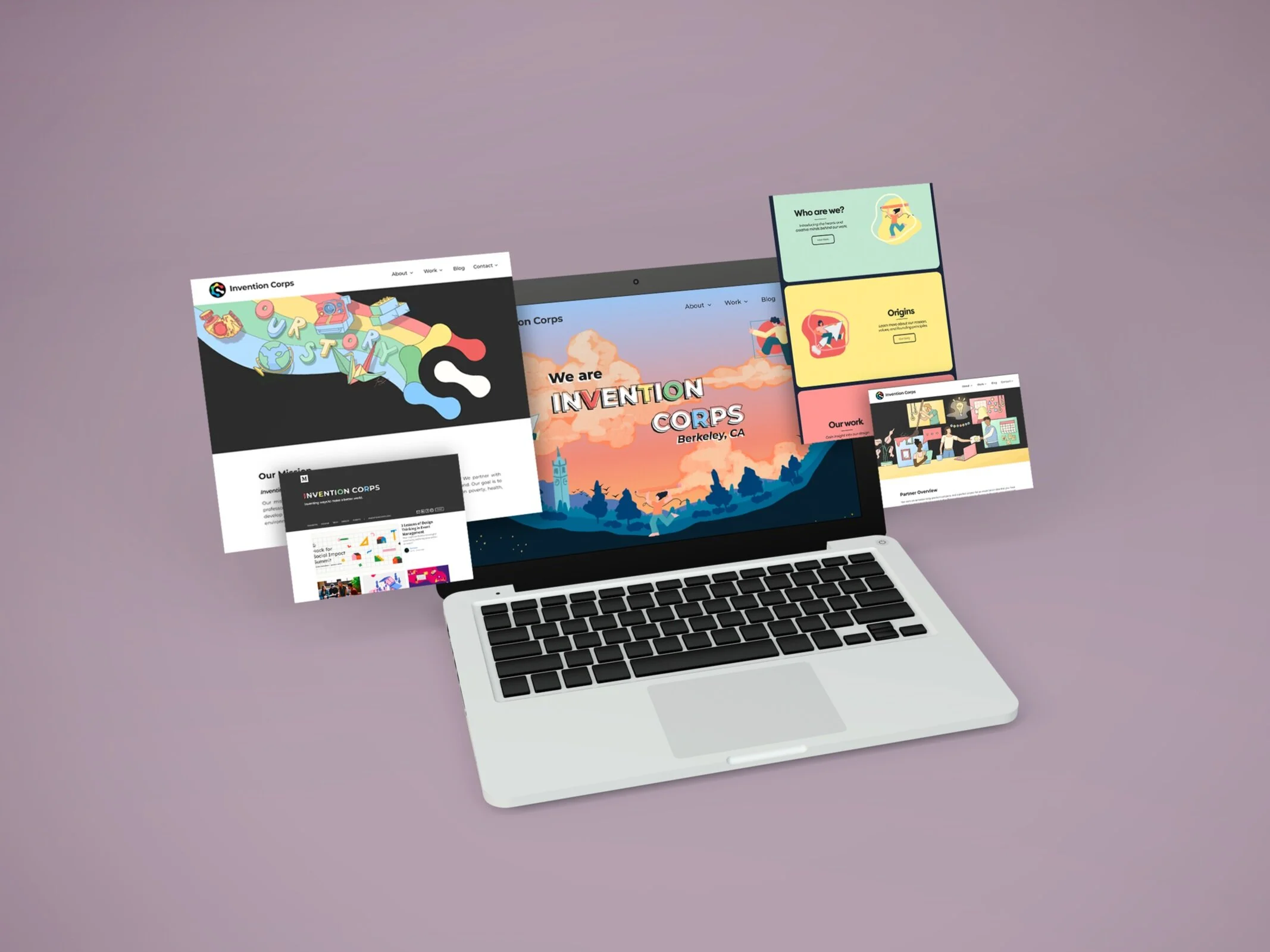
landing

about us

partner

blog

project pages

members
The Process
Our process can be divided by the ‘How might we?’ questions that guided our brainstorming and iterations.
—How might we design a website that distinguishes our brand identity from others?
We began the design process with a diverge and converge method, meaning each member of the design team took time to brainstorm their own ideas for potential website layouts, with no limits to feasibility. Once we had some time to visualize our thoughts, we converged to review everyone’s ideas and note what we liked from each of them. Then, we discussed possible ways of combining all of these traits into one cohesive design.


—How might we create personalized assets and components that not only align with our brand identity, but emphasize it?
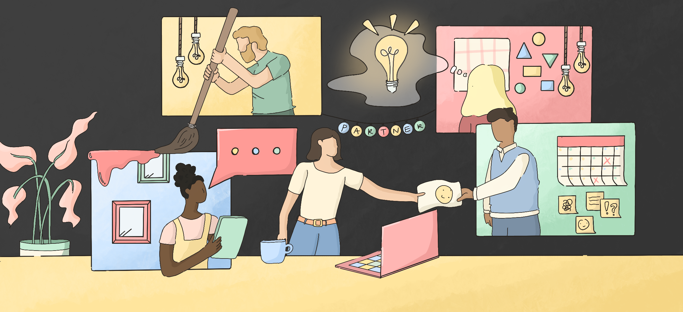
Once we settled on a concept for the landing page, we set out to create assets that would help merge the design into a cohesive whole. These assets included illustrations for the page previews, custom icons for our four pillars, as well as banners that top each page. Pictured below are banners illustrated by me for the Partner, Projects, and About Pages.


—How might we design the projects gallery and individual project pages to be intuitive and informative, yet not overwhelming?

We started with lo-fi wireframes of potential designs that are engaging but still communicate our desired message effectively.
Our ideas included a comic-style format, an interactive geometric structure, a Hero’s Journey inspired layout, and more.


Many iterations later, we arrived at a final design that took into consideration our development timeline, content readability, and flexible application.
—How might we communicate the hearts and diversity of our members through details in the web design?
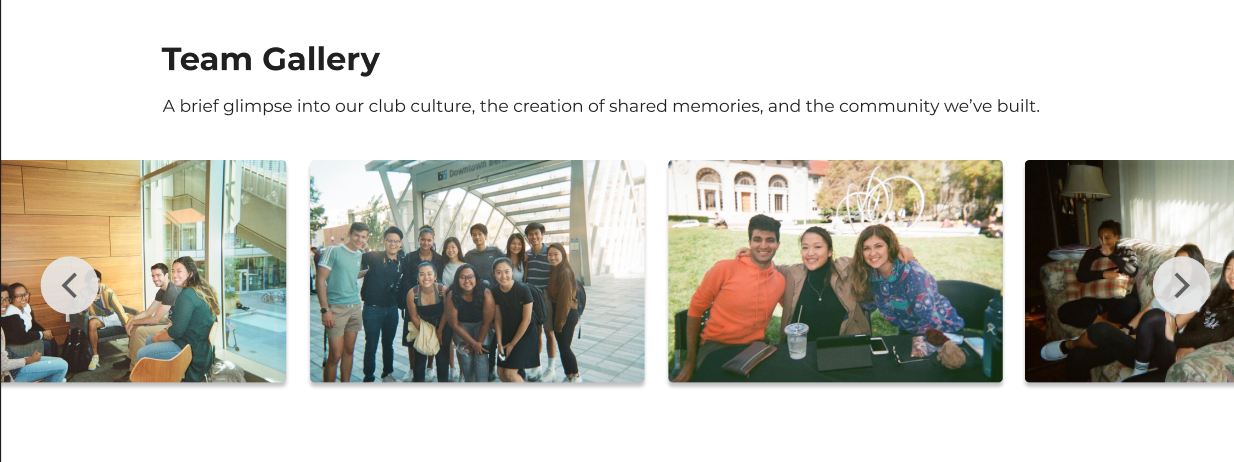
One of the aspects of our organization that we value most is our diversity and multidisciplinarity. We welcome members from all walks of life, studying any major, in any year, with any level of experience, as long as they have a passion for social good and creative thinking. To highlight this through our website, we included features like personal quotes from each member, a team gallery, graphics displaying our member and major breakdowns, as well as personal artwork from our members.


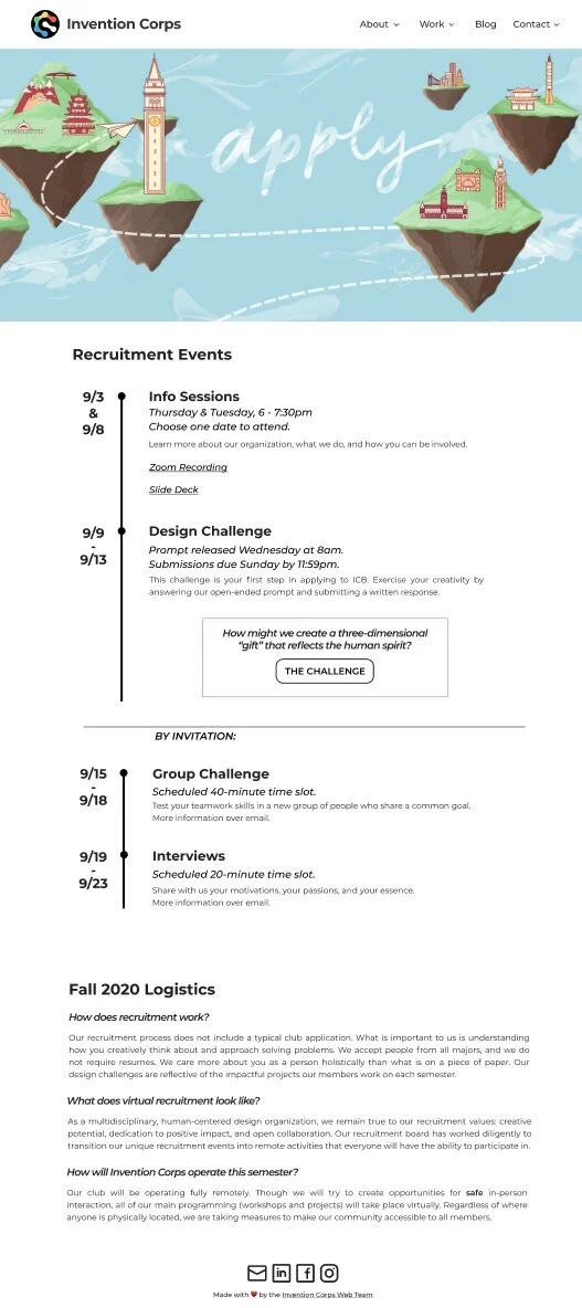
—How might we design a simple, yet informative recruitment page that provides all the resources a potential applicant would need?
Recruitment season has always been one of the most exciting times of the semester for campus organizations. This semester, however, the online transition meant we were unable to operate traditionally and had to transfer everything to our website. This meant that we needed a recruitment page that was informative, resourceful, yet not overwhelming. To accomplish this, we incorporated our recruitment timeline, explanations of how we are handling the online transition, links to our info sessions, our recruitment graphics, a point of contact for any questions, and finally, a detailed description of prompt.